Showing posts with label painting. Show all posts

Monday, June 20, 2011

Presto Chango part deux: Pink Meets Nest, cont'd

You may remember my previous post about ditching the nasty green paint and curtains in my dining room in favor of lovely, light shell pink walls. The change made that little square room seem so much bigger, and the pale color capitalizes on all the light that we get in there.


Here is the before:


And here is the after!


I thought long and hard about a new light fixture. Something industrial? Something with lots of glass? Logistics and budget got in the way or changing the entire fixture. I wanted to transform a wine jug into a hanging pendant, but trying to find an antique wine jug, having the bottom cut out, wiring it, and hanging it so that it didn't collapse on the table due to its own weight was like trying to learn how to perform brain surgery. Not to mention the fact that it's hard to find wine jugs locally, and to have one shipped is expensive! So I decided to let blue-green and glass have its presence in the room in another, more sentimental way, namely, in the form of my grandmother's little glass bottle, vase, and antique telephone insulator. A quick fix to the dark light fixture was a can of white glossy spray paint, and voila! A whole new lightness came into the room.


I spy ikat! Ikat is everywhere nowadays, and it's such a fresh, natural alternative to fussy florals. I loved this dreamy, watery Robert Allen Khanjali in Glacier and had to have it in my house somehow. My wonderful mother-in-law sewed these curtains for my birthday, and I love the way the pink walls bring out the warm barely-pink in the ikat. The hardware got a "lift" with Crate&Barrel cafe rods in matte bronze.


Luke and I first saw the artwork of Scott Raimondo on our babymoon in St. Augustine, where he lives and works. Love his fresh, colorful landscapes and views of the water and area. I ordered these white frames and matts from framesbymail.com. They don't have a huge selection, and it is a risk not seeing the matts and frames in person, but if you don't need a specific color matte or a certain tarnished gold finish on your frame, for instance, you can get a great deal. The frames come assembled and you simply matt the artwork, and place the glass, art, and backing in the frame and put the hardware on top. I got all these framed for about $175 (including glass)--probably 25-30% of what I would have paid at a frame shop.


The little ladies and their fans above the sideboard are vintage placecards that belonged to my great-grandmother. I matted them and put them in $2 frames from Hobby Lobby. Not a bad deal! They make the ceiling seem so much taller and make that sideboard more of a focal point.


Check out the way the curtains bring out all the beautiful colors in this antique door that we use as a coat rack in the living room. Loverly!


Pin It

Saturday, February 26, 2011

Presto Chango part deux: Pink Meets Nest

A few weeks ago I did a presto chango on my great-grandmother's bench. It had been sitting at the foot of our bed for years, and I FINALLY livened it up with some new fabric, lots more batting, and a fresh coat of semi-gloss. Gosh, it was good for my soul!


Well, I've been wanting to do something to our breakfast room (dining room) for a long time now. We had actually left it the color it was when we moved in, and had kept the drapes that were here, too. They really started getting to me. I love fresh rooms---sea glass and Swedish colors: pale greys, blues, greens, and shell pinks, topped off with lots of white and paired with clean-lined, textural, industrial furniture (and beautiful family heirlooms) when I can afford it.

So Thursday my mom came down to see "me" (a.k.a. Charlotte!) and we had a fun day going around town. We went to the fabric store with the intention of looking at fabric for new drapes for the dining room, but as we were getting back into the car, I said that I'd really like to paint the room pink. So we went back in the store, looked at fabric again, and then went to Home Depot to buy a lovely, pale, glowing shade of shell pink flat paint. Thursday night and Friday morning I gave the little room two coats and voila! A breath of fresh air! Bye bye ugly green paint and gross curtains!
before


after! I love the way the color of the wood shines next to the pink.


Even Charlotte likes it!


It is a little bare right now, but I do like the spareness of it. Next stop: new light fixture and curtains. 
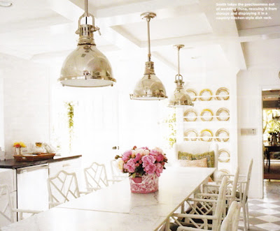
I'd like to put in some kind of pendant light fixture that contrasts with the wall color. Either something industrial or some kind of white, modern orb.
Pottery Barn Exeter 5-Jar Pendant

love these chrome fixtures! Maybe too much bling for my little room, but I'm keeping these in mind for my future dream house.

Ballard Designs Eldridge Pendant

I want the curtains to be clean and fresh and not too girly. Check out the fabric I'm looking at now. Which is your favorite?
Graphic flowers on a natural white. Cool, or too frilly?

Love the cleanness of this.

LOVE this fabric, but is it too old-lady with the pink? Maybe I should use it for pillows somewhere else?

This fabric is by Anna Maria Horner. I love it!!

So that's what's new around here. 

When people think of pink, they usually love it or they hate it. What about you? Have I turned you on to the power of pink?

Tuesday, August 24, 2010

Easy on the eyes

In the spirit of cleaning off my desktop, I'm posting other images I've collected through the months. Lots of great color and pattern, the wonderfully fresh style of artist Eric Ravilious, cool posters, etc. Like in my previous post, I apologize for not having sources for many of these. If something is yours, let me know and I will of course credit you! 


Lombardy Poplars, a watercolor done in 1935 by Eric Ravilious (1903-1942). I might do an entire post on his work. His paintings have a wonderful cut-paper quality. 

Scandinavian rug by Moroso


Garden Roses Wrapping Paper from Paper Source. Who knows? This might show up in our baby girl's birth announcement. ;)


Friday, July 2, 2010

Palladian Blues

Today I was off work for the 4th of July, and Luke and I painted the baby's room! We used Benjamin Moore Palladian Blue, and I can now safely say that nearly my entire house is blue...just the way I like it!

Thursday night we moved all the guest room furniture out and the baby things in. I tested out the paint on our butter-yellow wall... it was a perfect pale blue-green.


This morning, we went on a walk and then we got to work. Luke did the cutting in and I did the rolling. 


And voila! Our beautiful new baby's room! You can see the mismatched chair and ottoman I picked up at the Jr. League garage sale and had recovered. I painted that little desk a glossy white and got milk glass handles for it. 


This painting is by my mom--it is of my playhouse that Dad built it for me when I was little. The playhouse used to be pink. Funny enough, it's now Palladian blue.


(Here's the playhouse today! Back in action!)


Here I am cooking dinner at the party kitchen:


We put together the Ikea dresser a few weeks ago, and hung the shelf over it...baby girl's "wardrobe"!